As may be apparent by the eggplant color scheme on my website, I am not a graphic designer, and while, yes, I do often look stylish and may I say, fabulous? — that’s mostly because I’m tall. I’m sorry.
Still, while I know some may find it garish, I like my eggplant color scheme, and I want to enforce it on my website, whatever the cost.
Without custom CSS, I have a limited supply of custom colors. Depending on the theme you have selected, you can customize a few elements of the page in the built-in interface. Within the “P2” theme that I’m using, you can change the Background, the link color, an accent color, and a second accent color. Without my custom CSS, it looks something like this:

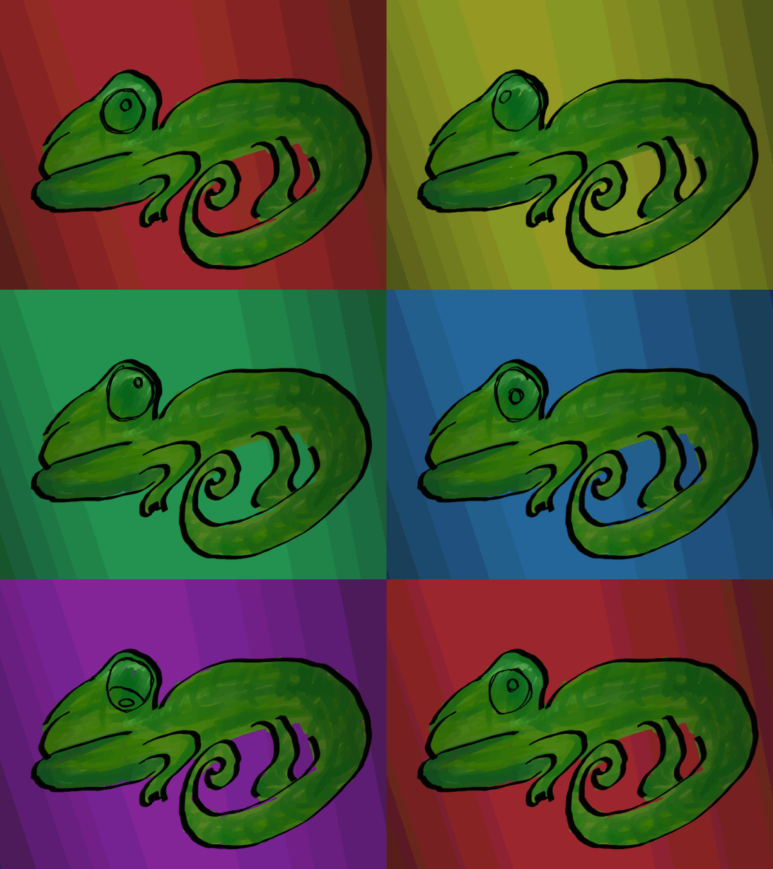
All that white is way too clean for me. I like things a little more wild, though it’s probably a good idea to stick to a color scheme, lest your users become overwhelmed like my poor little chameleon here.

About five colors, give or take one or two, is good for a color scheme. To keep track of your colors, you can label them at the beginning of your CSS. You can comment them out if you like, though if they’re not selecting anything, they’re not going to affect anything. It’s probably a good habit to comment things out though.
My color scheme is like this:
/*Post Background: #701A6D

Widget-Background: #F5989D;

Headlines: #2CDB5D*/
And there are some other elements that I left to the built-in WordPress editor. It’s a pretty robust editor, and it handles several iterations and complementary iterations of elements at once. For everything that’s there, it saves a lot of time over writing each individual element in code, and sometimes the built-in panel can be difficult to override as well.
As you find the selectors you want to alter on the page using the inspect element tool that we talked about last time, you’ll often have to add a class or two to the element to get the style to “catch.” I couldn’t get my purple background with “.post” or with “.type-post” on their own, but “.post.type-post” works fine. That arrangement doesn’t mesh with what I know about CSS, but I’d love an explanation if you have one!
From here, nothing diverges too much from what you know about CSS already, thankfully. My advice at this point is to trust the WordPress interface as much as you can, and just put a few curly braces in here and there when you need to. Though, you might have more difficulty if you want to start rearranging things. Themes are mostly about the layout. It might be a bigger fight once you start meddling with that. Well, let’s not back down. I’ll look into it. For you.
❤
LL
#brochures, #color, #css-guides, #information, #technology, #wordpress-com

1 comment