
Another thing that’s nice about the default themes is that a good many of them, these ones specifically, are already optimized for mobile, so that anything you do will be reflected across platforms, so that users will have roughly the same experience whether they see your site on desktop, phone, ipad, or other device.
Once you start customizing the CSS, however, you have to check a few more things. Last night was the first time I looked at my site on mobile since I added the columns in part two, and it was truly horrifying.

This was a terrible and desperate situation, and something had to be done about it immediately. And so, as soon as I had drawn a cute seal to somehow illustrate the point of “having mobile difficulties” I set to work.

Of course, if all else fails, I can disable the columns. I am not married to the columns. That’s the root of the difficulty here, and essentially what I want to happen, just on the mobile site. I do like the way they look on the desktop site, but is there a convenient way to seperate the layout of the two pages?
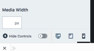
Let’s take a look at the layouts. You can do so conveniently by looking at the bottom of your CSS window.
Our previous methods of examining the layout of the page prove fruitless here. All the elements have the same classes, the same code attached to them. There are additional layout elements in the browser to make this page look like a mobile site, but they won’t appear anywhere else.
In the CSS help on the WordPress site, they mention a body.mobile-theme class, so assuming everything follows the same structure from there:
body.mobile-theme article {

column-count: 1;

}
Huh, it didn’t work. Oh, I know. Let’s try:
body.mobile-theme article {

column-count: 1 !important;

}
Still nothing. How about:
article.mobile-theme {

column-count: 1 !important;

}
body.mobile-theme{

display: none;

}
and the one time I expect nothing, nothing happens. Meaning, nothing changes. I don’t think the body.mobile-theme class is current.
Unfortunately, the solution I found is a little hard to deduce. I had to crawl on the forums and find a similar syntax to apply to my situation. In the end, the code I put in was:
@media screen and (max-width:960px) {

article {

column-count: 1;

}

}
and now everything looks nice and clean. Except those tables.

I guess it gives me more reasons to come back.
❤
LL
 Post Modern Existential Horror